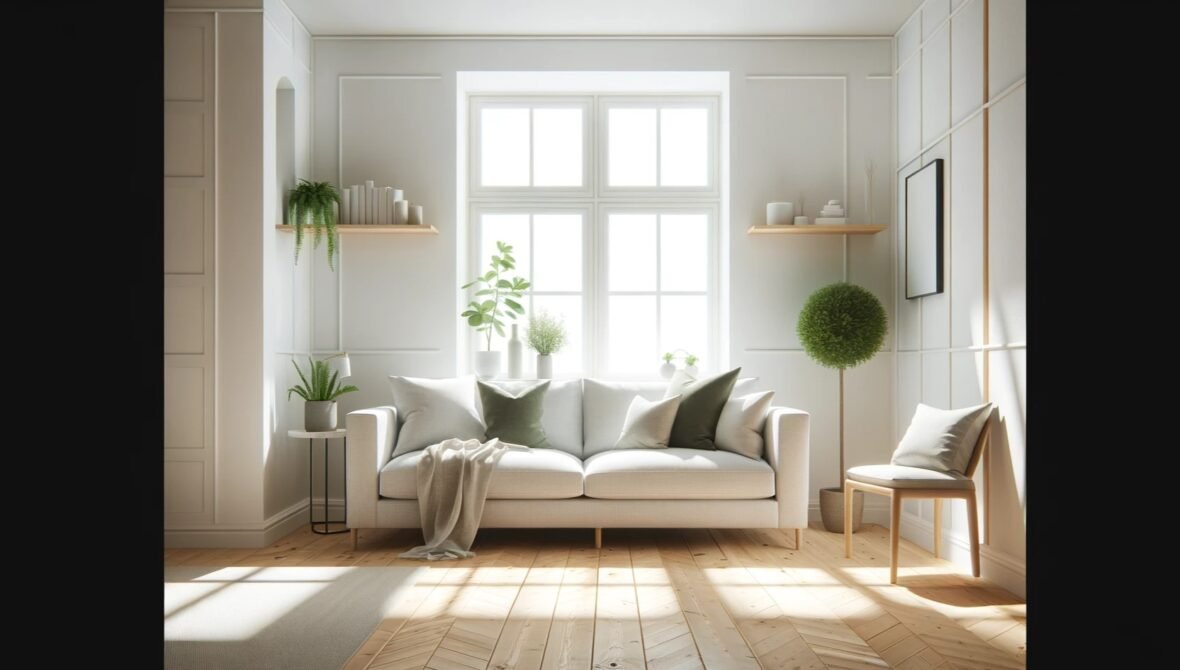
Scandinavian design is one of the most misunderstood aesthetics in contemporary interiors. The version that circulates on social media — white walls, pale wood, a single plant, a linen throw, everything immaculate — is a photogenic reduction of something much more considered. The real thing isn’t a look. It’s a set of priorities that grew out of specific conditions: long dark winters, a tradition of craft, an honest relationship with natural materials, and a deep practical concern with how a room actually functions for the people living in it.
I’ve worked in rooms built around this philosophy and ones that were simply imitating it. The difference shows up quickly when you spend time in them. Here’s what the genuine version looks like.
Light is the foundation
Nordic design is, at its root, a response to the problem of light. In Scandinavian countries, winter light is scarce and precious. Interiors were developed to maximise what there is — pale surfaces to reflect it, minimal window dressing to let it in unobstructed, warm lamplight in the long dark evenings. The whiteness and the simplicity aren’t aesthetic choices so much as practical ones that became aesthetic ones.
If you’re applying this to your own home, start with light rather than colour. Where does your natural light come from and at what time of day? Which surfaces could do more to reflect it? What’s blocking it unnecessarily? The palette — whites, off-whites, pale greys, warm neutrals — serves this purpose. It isn’t decorative minimalism; it’s a considered response to the quality of light in a room.
Natural materials, honestly used
Scandinavian design has a particular relationship with wood that’s worth understanding. It isn’t decorative wood — a veneer applied to MDF, a dark stain applied to hide the grain. It’s solid wood, lightly finished to show what it is, used for objects that are genuinely functional. A dining table with visible grain and honest joinery. Chairs with the kind of construction you can see and understand. Shelving that reveals the material it’s made from.
The same applies to textiles. Wool, linen, cotton — materials with texture and weight, chosen for how they feel as much as how they look. Nothing synthetic that pretends to be something else. In a well-executed Scandinavian interior, every material announces itself honestly.
Function informs form — not as a constraint but as a value
The concept of hygge — the Danish and Norwegian word for a quality of cosiness, convivial warmth, comfort — is often cited as central to Nordic design. What it means in practice is a room designed for actual use: for sitting in for long evenings, for eating with people you like, for reading, for rest. Not a room designed to be photographed.
In the rooms I’ve worked in that captured this quality, furniture was arranged for conversation rather than the appearance of space. Lighting was layered — multiple lamps at human scale, candles on the table, nothing harsh from above. Blankets were present and accessible, not folded tightly and placed to look like a styling prop. The room communicated that it was for people, and people felt it the moment they walked in.
Restraint with objects
Scandinavian minimalism doesn’t mean empty rooms. It means rooms where every object has been chosen and placed with care, and where nothing is there without reason. A ceramic bowl on the dining table. A well-made lamp. Three books left out because they’re currently being read. A plant that’s been there long enough to grow into its corner.
The discipline required is not in removing things relentlessly — it’s in resisting the accumulation of things that don’t add anything. The rooms I’ve seen done right had a quality of stillness: not empty, not sparse, but settled. Everything in its place, every object with a reason to be there.
Colour, used carefully
The idea that Scandinavian interiors are colourless is wrong. They are controlled in their use of colour — which is a different thing. A muted sage green on a single wall. A deep charcoal in a study. Dusty blue cushions against a natural linen sofa. These are considered colour choices, pulled from nature and used with restraint so each one carries weight.
The colours that fit this aesthetic are generally desaturated — not bright, not pastel, but the colours of stone, lichen, birch bark, winter sky, sea at dusk. They read as colours that belong to the natural world rather than ones invented for a trend cycle. They age well, too: a room built around these tones in 2010 still looks considered today.
What makes it fail
The version of Scandinavian style that doesn’t work is the one that’s all surface. White walls, a matching set of pale wood furniture from a flat-pack retailer, a single succulent, everything perfectly arranged for a photograph — and nothing that suggests anyone actually lives there.
The genuine article is lived-in. The blanket is actually used, not positioned. The books are actually being read. The plant has been there long enough to lean slightly toward the light. The objects were chosen over time, not purchased as a set. That quality of habitation — the evidence that real life is happening inside the aesthetic — is what separates a room that works from one that only photographs well.

Follow Me