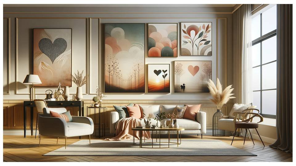
Most people hang art too small and too high. That’s the beginning and end of why so many walls feel wrong. Not because they lack taste, or haven’t chosen the right piece — but because the piece they chose is floating six inches above eye level, and it’s about the size of a paperback book on a wall that wants something with presence.
Wall art is one of the last things people think about and one of the first things you notice when you walk into a room. After years of seeing how it worked — and didn’t work — in real homes, here’s what I actually know about getting it right.
Scale is the whole conversation
A piece of art should feel proportionate to the wall it’s on and to the furniture below it. Above a sofa, the art should span roughly two-thirds the width of the sofa — not the whole width, but enough that it’s in dialogue with the piece of furniture beneath it. A small print above a long sofa is the visual equivalent of a whisper in a loud room.
I’ve watched clients fall in love with a piece of art in a gallery, buy it, hang it at home, and feel quietly disappointed — because it looked significant in the white cube of a gallery and small on their wall. The gallery effect is real. Before you hang anything, hold it against the wall and stand back. Take a photo with your phone. Look at the proportions. If it looks lost, it is.
Hang it lower than you think
The standard advice is to hang art so the centre of the piece sits at eye level — around 145–150cm from the floor. Most people hang it higher. The result is art that you look up at rather than into, which creates a strange kind of distance between the object and the person in the room.
When art is hung above furniture — a sofa, a sideboard, a headboard — bring it closer to the piece below. There should be a conversation between the furniture and the art, roughly 15–20cm of space between them. More than that and they begin to feel like separate decisions rather than a considered whole.
One strong piece beats a crowded gallery wall
Gallery walls became fashionable, and I understand the appeal — a wall covered in frames feels personal, collected, full of life. But most gallery walls I’ve seen in real homes (not in magazine shoots, where they’re meticulously arranged with professional props) look busy rather than curated. Too many frames of different sizes, different frame colours, different subject matters, all competing.
One significant piece — something large enough to own the wall, chosen carefully — will almost always do more for a room than fifteen smaller pieces arranged hopefully. If you love the gallery wall concept, constrain it: same frame colour throughout, consistent spacing, a clear visual theme. Coherence is what separates a gallery wall from a collection of things hung on a wall.
Art and the room’s palette
The most elegantly decorated rooms I worked in were ones where the art didn’t just sit on the wall but pulled something from the room — a colour that echoed the throw, a tone that connected to the rug, a mood that matched what the room was trying to be. This doesn’t mean the art has to match the curtains. It means there should be some thread between them.
A room in warm terracotta and natural wood is asking for art with warmth — earthy tones, soft ochres, organic marks. A room in sage and linen is asking for something quieter — a botanical study, a muted landscape, a line drawing. When the art fights the room’s palette, both suffer. When they align, you stop noticing either one as a separate element and start experiencing the room as a whole.
Don’t rush it
Some of the most beautiful walls I’ve seen were unfinished. A single piece, well-chosen, with empty space around it — space that might one day hold something, or might stay empty. There’s no rule that says a wall must be decorated. An empty wall with good proportion and a strong piece of furniture beneath it can feel more considered than a wall filled to capacity.
The pressure to complete a room — to have everything in place, nothing left undecided — leads to choices made from impatience rather than instinct. I’ve seen clients fill walls quickly, then spend years quietly resenting what they hung. The better approach is to live with a wall before you commit to it. Notice what the light does at different times of day. Notice what you look at when you’re sitting in the room. Then choose from that knowledge, not from the urgency to have something there.
What makes a wall feel loved
The walls that stayed with me — in hundreds of homes, over six years — were the ones that told me something I couldn’t have predicted. Not the most expensive pieces. Not the most fashionable ones. The ones that were clearly there because someone had a reason to put them there. A landscape from a place that meant something. A print found in a market on a particular afternoon. Work by an artist the owner had met.
Art on a wall is one of the few decorating choices that says something true about who lives in a room. Don’t let that opportunity go to something generic just because the wall felt empty. Wait for the thing that earns its place — and when you find it, give it room to be seen.

Follow Me